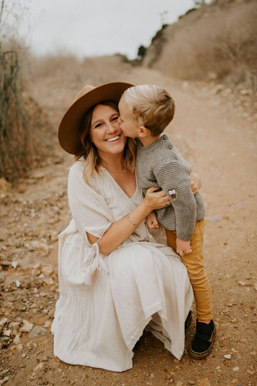
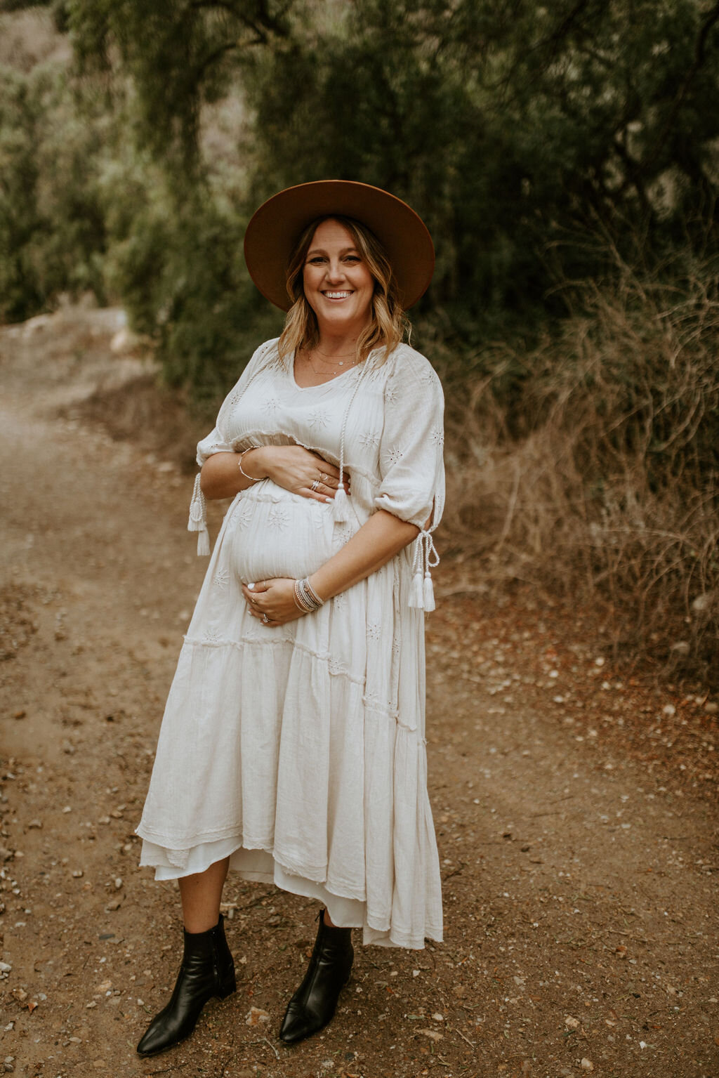
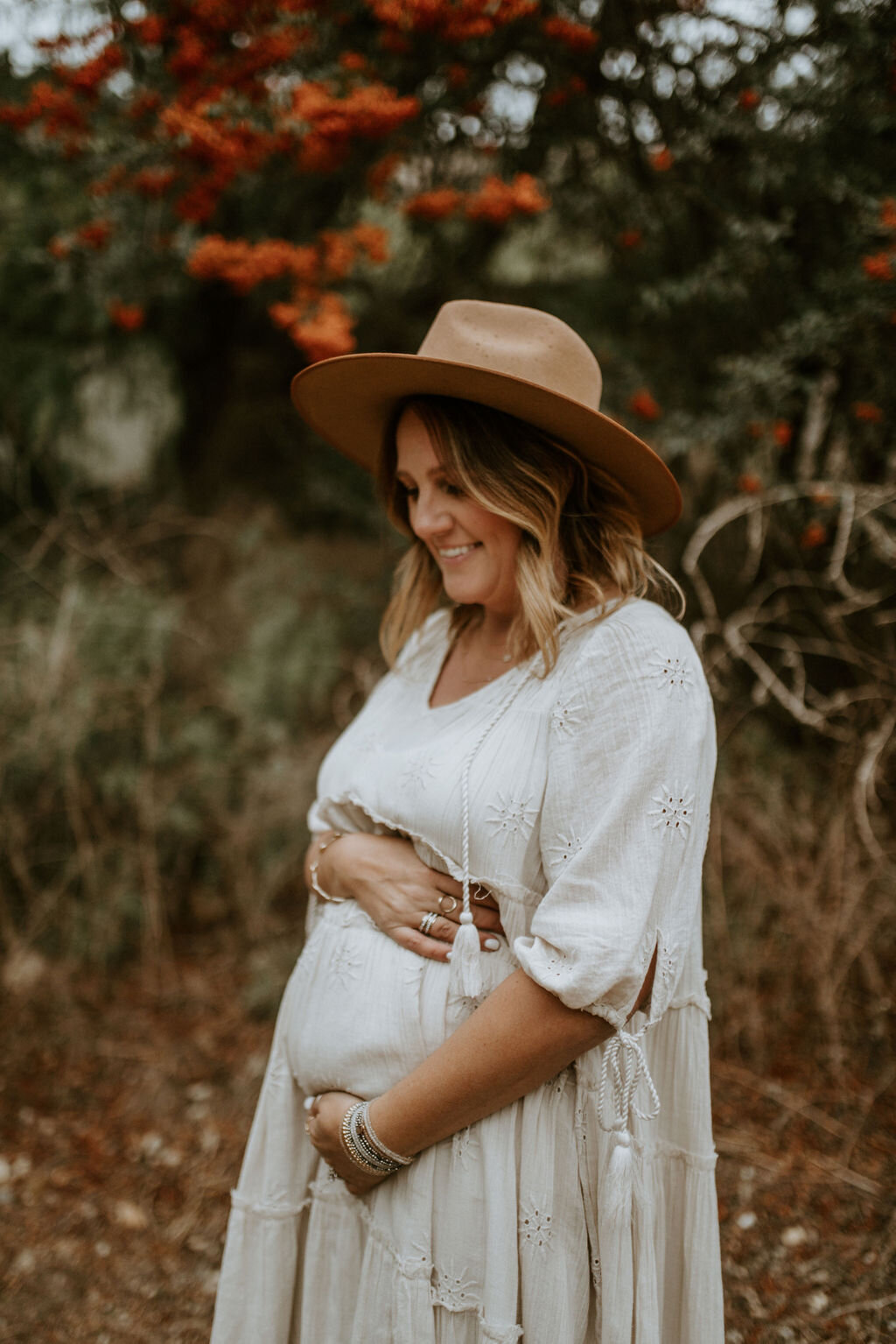
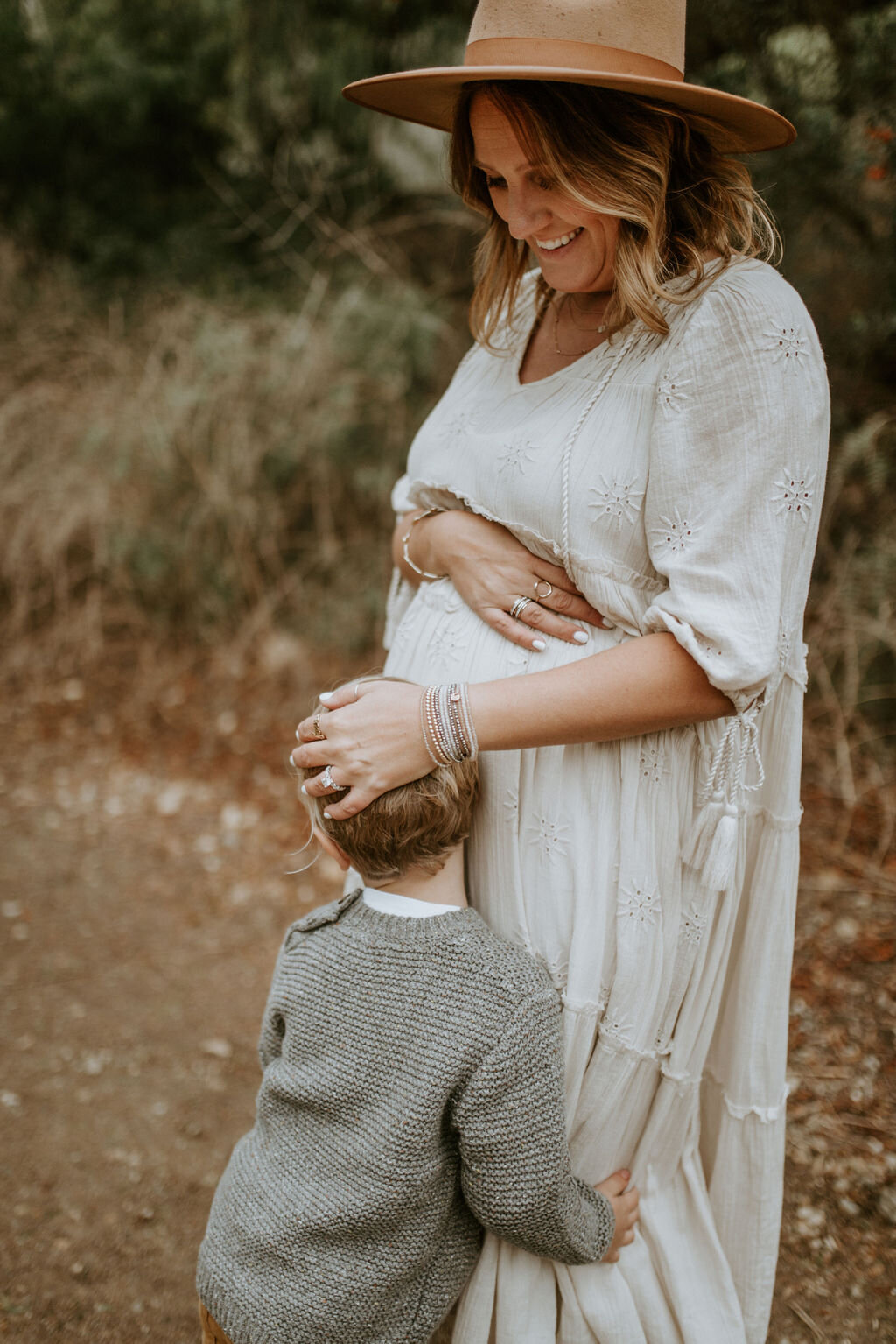
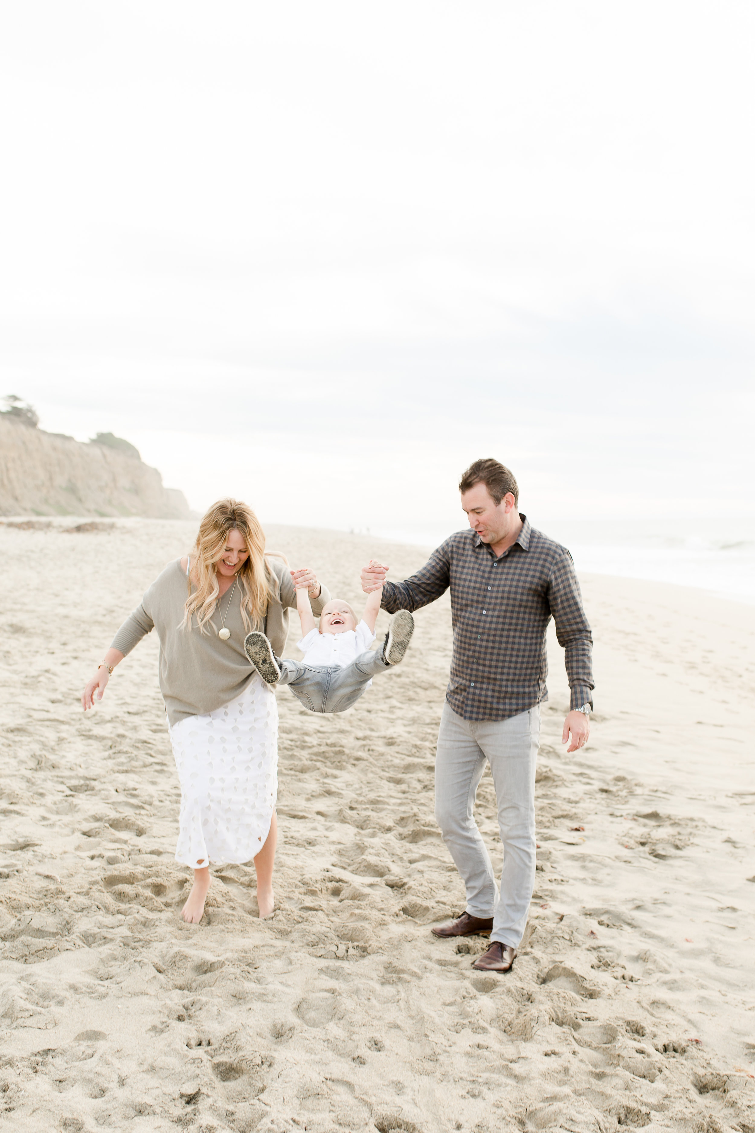
How I create a consistent aesthetic in my photos

If you haven’t already read my basic photography tips to create a curated style, it’s best to start here.

IMG_0413.JPG

How I edit my photos and the apps I use to create a consistent aesthetic in my Instagram feed

Favorite Apps

I usually end up using between 1-4 apps from start to finish when editing my photos before posting on the gram. I feel like I have tried them ALL, and finally found the ones that work the best and are quick and easy! Some of my favorites are Lightroom [free], snapseed [free], retouch [free] and unfold [for my stories] and VSCO [free].

photo editing apps.PNG

VSCO

After using VSCO forever, which totally worked to start with, I switched to Lightroom and I don’t think i’m ever looking back. VSCO has some really great one click filters you can apply and it’s a great place to start for beginners! Favorite filters are A6, M5, and I used G6 for a long time. You have the ability to copy and paste the same filter to multiple images at the same time, so this always helped plan a consistent style and easily edit blog posts that had multiple images. I still adjusted all the things even after I applied a filter so, you can use the same tips I’m sharing below from lightroom, in VSCO. Start by adjusting the strength of the filter and then focus in on the exposure, white balance [temperature], and HSL [color saturation and hue].

BEFORE

BEFORE

EDITED WITH VSCO A6 FILTER

EDITED WITH VSCO A6 FILTER

EDITED WITH MANDI NELSON PRESET IN LIGHTROOM

EDITED WITH MANDI NELSON PRESET IN LIGHTROOM

Even though VSCO’s filters are basically free [some you pay for] and presets can sometimes get pricey [anywhere from $30-$120 for bundles] I switched to Lightroom because I liked the professional preset options better, as it adjusted more things for me ahead of time. With VSCO I would spend so much time perfecting the tweaks because their filters just didn’t work on all my photos and sometimes a I just couldn’t find the right adjustments to make it consistent with my feed. Lightroom has presets made by professional photographers and I found they made more changes built into the preset that made it really easy to get a consistent and professional look to all my images no matter where or when they were taken. One thing I do like better about VSCO is you can edit the strength of the filter as a whole, vs in Lightroom you can’t adjust the intensity of the preset.

BEFORE

BEFORE

EDITED WITH VSCO A6 FILTER

EDITED WITH VSCO A6 FILTER

EDITED WITH MANDI NELSON PRESET IN LIGHTROOM

EDITED WITH MANDI NELSON PRESET IN LIGHTROOM

LIGHTROOM + PRESETS:

After 3 years and countless apps and filters, I found the easiest way to get a consistent style from all my images is to apply a preset in the Lightroom photo editing app. They have a mobile version or a desktop. I have both, but to be honest, I find myself using the mobile version 90% of the time, and it’s free!

I went through so many Instagram accounts to find the presets that worked best for me. I like a natural look with crisp, cooler feel with a hint of orange, less yellow and muted greens. If that makes no sense to you, don't worry, just find someone you like and try it out. You can give any preset your own stamp by adjusting things like the exposure, tint, temperature and color hues and saturation [skin tone]. It took me about two months to really start to understand what changes when I adjust what, but now I really think I’ve got it down!

BEFORE

BEFORE

EDITED WITH VSCO A6 FILTER

EDITED WITH VSCO A6 FILTER

EDITED WITH MANDI NELSON PRESET IN LIGHTROOM

EDITED WITH MANDI NELSON PRESET IN LIGHTROOM

Current Preset:

Mandi Nelson

I love how crisp and cool her's are-but I adjust the oranges and yellows quite a bit. [I'll show you how I use hers in a later in this post]. You should also go to her story highlights on her IG there’s a crazy amount of good tips on there and she reviews tons of FAQ’s about lightroom + how to use presets. Here’s just one example of how you can really have your own style, even when using a preset. Mandi’s feed vs my feed using the same lightroom preset still look very different because of our photography style and editing.

IMG_5040.jpg

Previous preset:

Jessica Janae

These are what I used for my first 3 or 4 installments of #thedailymoments and about 3 weeks on my Instagram feed.

Steph Pollock suggested her and uses her presets beautifully. You can see below the difference between my style and Stephs. It just shows you how diverse a preset can be and that by using a preset someone else uses, doesn’t always mean your images will look exactly like theirs. It’s all in how you shoot, the lighting, editing angles and how you adjust the presets.

Steph pollock IG feed.png
occasionally_perfect photo editing tips.PNG

Other Presets I love:

Jenna Kutcher

Jenna is a beautiful soul, excellent photographer and someone I adore! Her presets are perfect for the beginner because she gives you a ton of easy one click options that don’t need a lot of adjustments.

JennaKutcher presets IG Feed.PNG
JENNA KUTCHER PRESET EDITING TIPSJPG
EDITED WITH JENNA KUTCHER PRESETS

EDITED WITH JENNA KUTCHER PRESETS

Bethany M Poteet

Her presets make me feel like i’m sitting on a white sandy beach. Such a pretty and calm vibe.

IMG_4901.PNG
BEFORE

BEFORE

EDITED WITH BETHANY POTEET PRESET

EDITED WITH BETHANY POTEET PRESET

EmmyLowe x BurtsBriPlease

I mean, don’t you just want your whole house to look this crisp, clean and happy?

burtsbrispleasepresets.PNG

Sophia Elrae

If you want a moody or warmer fall vibes, love this mamas presets.

sophiaelraepresets.PNG
BEFORE EDITS

BEFORE EDITS

EDITED WITH SOPHIA ELRAE PRESETS - COOLSAGE

EDITED WITH SOPHIA ELRAE PRESETS - COOLSAGE

Adjustments to presets [lightroom] or filters [vsco]:

The first thing I do to my photos is apply my preset and then I adjust from there. I focus on 3 things, exposure [brightness], temperature [warm or cooler] and color saturation [skin color and landscape vibrancy]. I also adjust the sharpness or grain if the image needs it but not always, this is already done in my preset, so it’s one less step to edit.

First edit, add preset

First edit, add preset

Then adjust exposure + shadows +highlights

Then adjust exposure + shadows +highlights

Go into Color tab, and top right is the MIX where you can change each color individually.

Go into Color tab, and top right is the MIX where you can change each color individually.

I typically change the yellow to get rid of artifical light and then orange to adjust skin tones.

I typically change the yellow to get rid of artifical light and then orange to adjust skin tones.

Exposure

I almost always [ok, always] adjust the exposure. I try and take all my photos underexposed or not in direct sunlight so that I can adjust the brightness myself once it’s in the app. I adjust exposure right after I apply the preset and then also after I do ALL my other edits to the preset. I sometimes need to go back and lower it if it’s too bright and lost some contrast or brighten it if it is still too dark.

IMG_4438 copy.jpg
IMG_4446.JPG

Temperature

This can help take a blan photo to a whole new level, adds yellows and oranges [warmer] or blues and greens for a cooler feel. I don’t adjust this much anymore, I use the Color Mix to really change each color. But, it’s a good place to start before you get crazy learning the adjustments to specific colors.

Color Hue + Saturation [skin tone]

Thanks to @hellojessiemartin [she’s the best account to follow for really good photo editing tips] I learned all about this part of Lightroom and it’s really upped my photo editing game.

3 colors I focus on adjusting in my photos are the yellows, oranges and greens. Start with the color MIX tab.

yellow: Taking the yellow saturation down, gets rid of that horrible artificial light in most homes and restaurants and makes your images more white + natural [like they should be]. Practice this one with a bathroom shot. It’s amazing what taking the yellow saturation can do to your photo! If you take the luminance up, it makes them even more white and bright.

IMG_0613 2.JPG
IMG_0613.JPG

orange: this adjusts skin tones, this one you have to play with because it everyone has such different skin, it’s really up to you to see what works best for you. Use the color mix tab and adjust the saturation first, then hue to adjust the yellow, orange and red undertones in your skin. Mandi’s preset already takes down the oranges, so I usually bring them up a bit from where she has them.

IMG_4986.JPG
IMG_5020.JPG

green: this is mainly for my outdoor shots or images at home that have my plant babies in them. I take the greens down a little so that it doesn’t stand out in my photos. Grassy parks or front yards can get a warm touch to them if you take the green out of the photo a bit.

IMG_3406 2.JPG
IMG_3406.JPG

How I edit in lightroom mobile [step by step]

Here’s an example of an edit from start to finish. I snapped a quick photo of Finn on my iPhone X on a cloudy day. The lights weren’t on in the house and the front door was giving off some light behind him. Let me walk you through my steps in Lightroom.

IPHONE SNAP ON CLOUDY DAY -BEFORE EDITS

IPHONE SNAP ON CLOUDY DAY -BEFORE EDITS

EDITED WITH MANDI NELSON - MINIMAL PRESET + ADJUSTMENTS

EDITED WITH MANDI NELSON - MINIMAL PRESET + ADJUSTMENTS

STEP BY STEP

Import photo into Lightroom mobile

  1. Scroll the bottom all the way to the right - add PRESET [I click through each of my options to preview as some pictures look better with different presets to start with, but usually end up with EVERYDAY by MANDI NELSON].

    *Depending on what preset you use these next steps may not apply to you. My preset already ups the shadows and takes down some colors, so you can use my screenshots as reference where they are.

    [use the 3rd slide as an example- I took the oranges up to +24].

  2. Scroll to the LIGHT tab - up the exposure quite a bit, Don’t worry if the skin tones look white here, you will adjust the colors MIX tab later and this will help fix that washed out look on the skin. Sometimes I take down the shadows too.

  3. Scroll to the COLOR tab - on the top right, you’ll see MIX, that takes you into the colors so you can adjust individually. ORANGES - fix skin tone. Start with the SATURATION and then go to the hue until you find the tone you like.

  4. Still in the MIX tab - click YELLOW. Adjust the saturation until you get the walls or whites in your photo the way you like them.

  5. EFFECTS tab- personal preference but I like less grain in my photos, so I take that down a bit on MANDI’s preset.

  6. To finish - go back to LIGHT tab, and adjust your EXPOSURE again to make sure you don’t loose contrast when brightening too much.

THAT’s IT!

That’s how I edit my photos in lightroom using the MANDI NELSON preset, EVERYDAY.

ADD TO LIGHTROOM, CHOOSE PRESET TO APPLY

ADD TO LIGHTROOM, CHOOSE PRESET TO APPLY

EDIT LIGHT - UP EXPOSURE +TAKE DOWN SHADOWS [IF NEEDED]

EDIT LIGHT - UP EXPOSURE +

TAKE DOWN SHADOWS [IF NEEDED]

COLOR TAB - MIX [TOP RIGHT CORNER] ADJUST ORANGES [SKINTONES]

COLOR TAB - MIX [TOP RIGHT CORNER] ADJUST ORANGES [SKINTONES]

ADJUST YELLOWS - TAKE THE SATURATION WAY DOWN TO FIX ARTIFICIAL LIGHT

ADJUST YELLOWS - TAKE THE SATURATION WAY DOWN TO FIX ARTIFICIAL LIGHT

ADJUST THE GRAIN. THIS IS TOTALLY A PERSONAL PREFERENCE BUT I LIKE LESS GRAIN.

ADJUST THE GRAIN. THIS IS TOTALLY A PERSONAL PREFERENCE BUT I LIKE LESS GRAIN.

GO BACK AND ADJUST EXPOSURE AGAIN IF NEEDED

GO BACK AND ADJUST EXPOSURE AGAIN IF NEEDED

OTHER PHOTO APPS I LOVE

SNAPSEED -

Oh how do I love this app so much!

Snapseed not only can adjust the colors of your photos, but it can adjust parts of your photos, it can auto correct your perspective and it can even EXPAND your image if you didn’t take those two steps back before snapping like I suggested. I’ll work on a tutorial of how I use them next because I actually use this one a lit to change the angle, and perspective of my pictures.

RETOUCH -

The best healing app out there. When I say healing, I mean get rid of that lady on the beach standing behind the perfect capture of your little one, removing the tv wires from a photo or the telephone wires from a super cute shot of the family. This app is super easy and makes it easy to get rid of all the little things you don’t want in a picture.

UNFOLD -

Unfold is the app that takes your IG stories to a whole new level. Picture collages never looked so good! You can add fonts, background frames and even upload videos and images on the same slide.

I hope this helps! I have so much more I’ve learned over the last two years, so maybe I’ll make this photography tips thing a more regular occurrence. If you have a specific question you want answered, feel free to comment below! Can’t wait to hear if this was helpful or not.

photography tips i've learned to create a curated style

the best photography tips i've learned for capturing your family perfectly, even on your iPhone.

BA350A9B-81E2-4048-AF44-33CD575E7316.JPG

If you're a mom trying to just get great photos of your family that you can frame, or if your an aspiring blogger who wants a curated and personal aesthetic consistently throughout your feed, these are some simple tips I've learned over the last few years that helped me do just that.

If you’re looking for step by step examples of how I edit my actual photos right now. Head over to this post. I walk you through everything step by step and show you how I use all my favorite apps.

Three things I focus on to keep my Instagram feed cohesive:

1. shooting [lighting + angles]

2. editing [presets, touch ups, and angles]

3. posting [9 grid]

90% of my photos I take on my iPhone X, and 50% of the time I use the portrait mode, it needs bright natural light to be crisp, so sometimes I can't use it to get the best shot. If I am using an actual camera, I'm usually using a Canon t3 that Jason bought for me 8 years ago. But truthfully, in my opinion, it's usually not the camera that makes the picture look good, it's the person taking it. It took me almost 3 years to finally feel like I kinda know what I'm doing at these are a few things I've learned that have helped me.

ikea duktig kids play kitchen hack.JPG

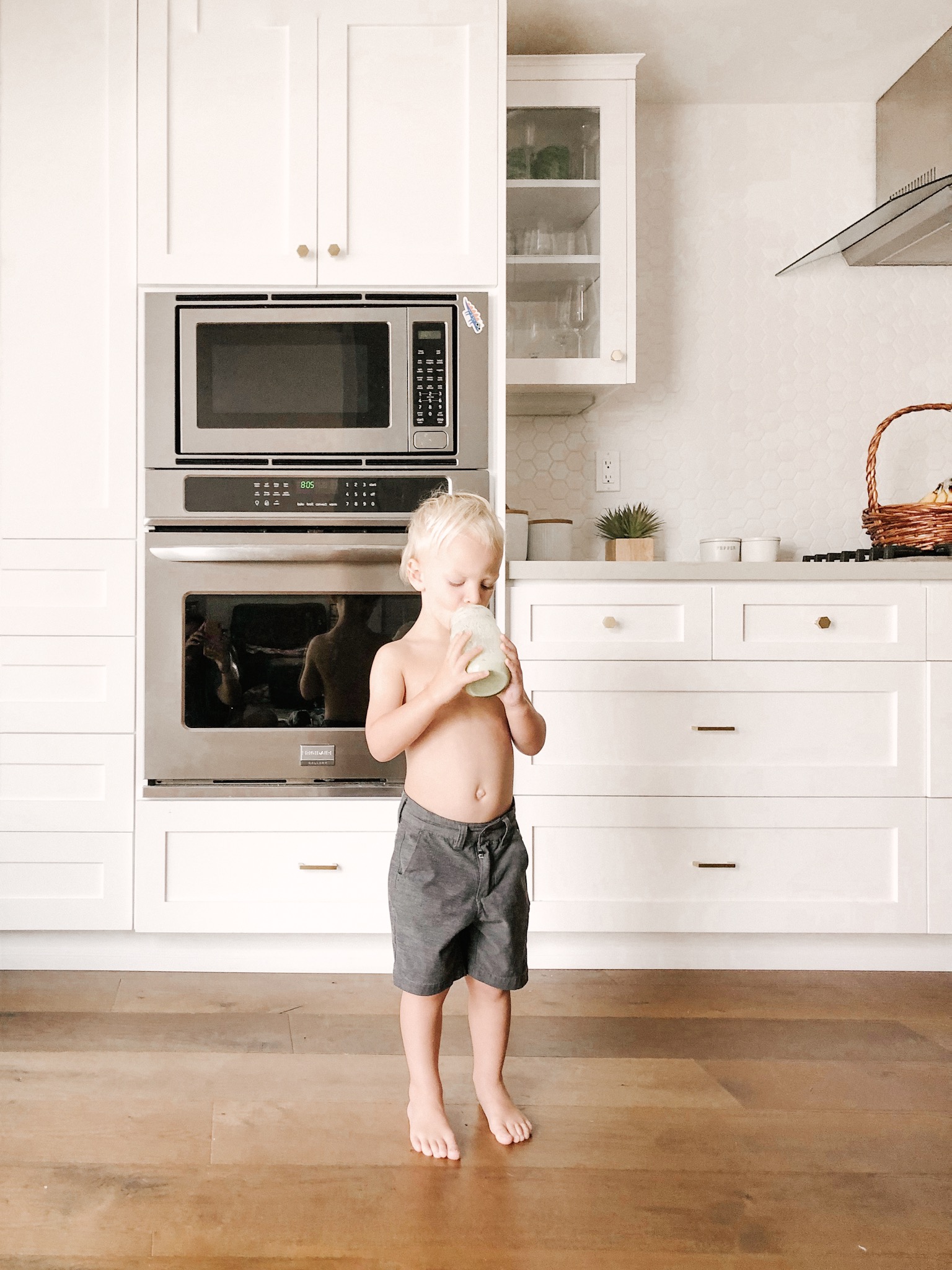
1. When shooting anything; people, food, scenery, selfies, be aware of your surroundings and don’t be afraid to take a few steps back and get more of the location in the picture. [you can always crop later]. A good rule of thumb I use when directing Jason to take a photo is to make sure you get our feet and our heads. It’s human nature to always want to take the image close to someone’s face but I like it when you get the whole picture of what’s happening in the image when you take it from farther away.

modern bohemian home large letter print.JPG

2. I almost always try and take my photos with natural light. If I’m outside, whoever is taking the picture [usually me] have them [or you] stand with your back to the sun. And try and avoid standing in the sunlight. Use a shaded area that still gets a good amount of natural light from the sun.

3. If you are shooting indoors, or with artificial lighting, you can get rid of the yellow tints by adjusting the yellow hues and the temperature of the image. [Lightroom does this best]. This is my favorite things I've learned so far. But when shooting, try and keep the lights off as much as possible and avoid using the flash. It’s easier to brighten the photo because it’s dark vs get rid of the yellow light or reflections from the glare of lights.

photography tips removing yellow artificial light.JPG
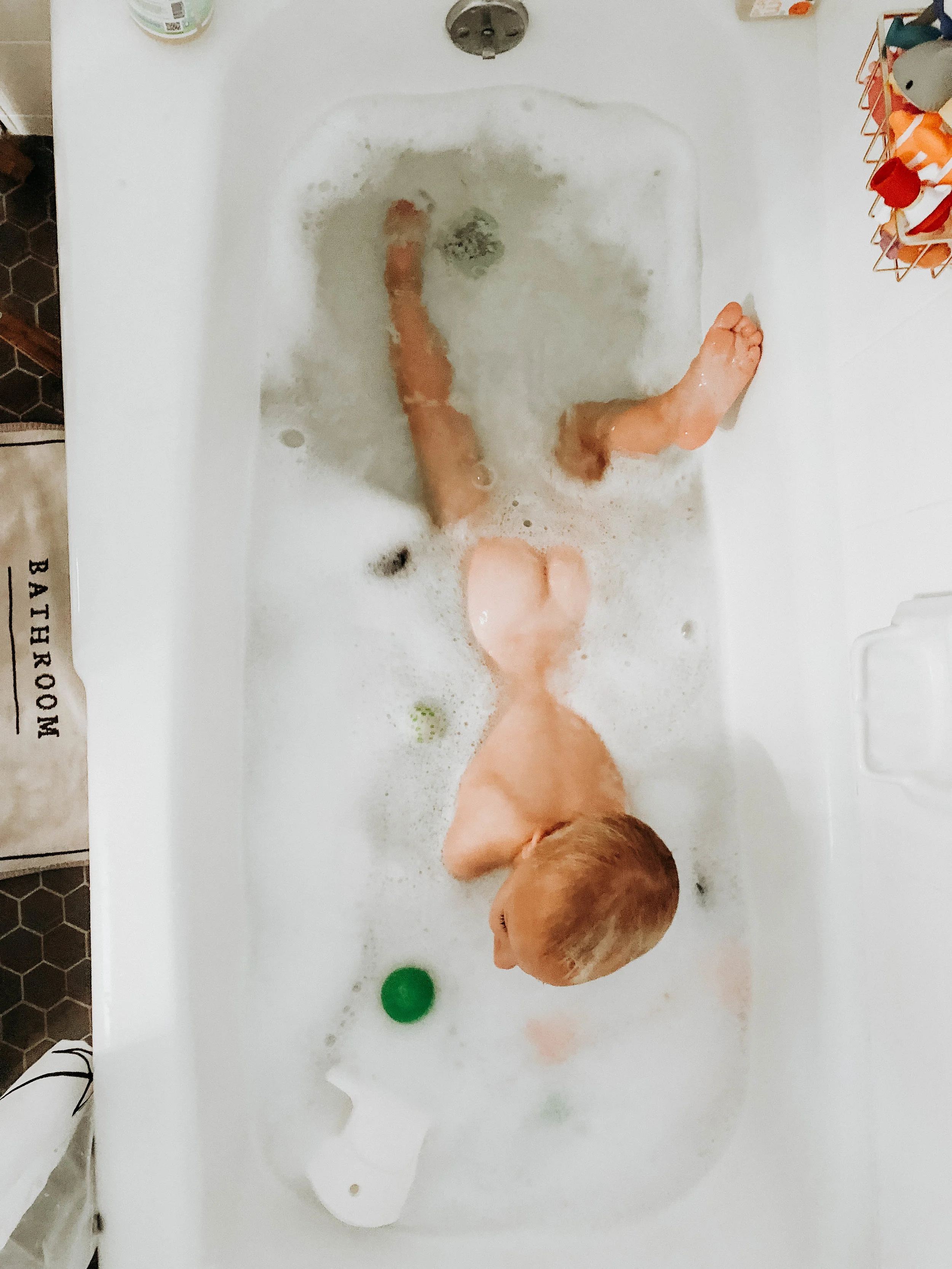
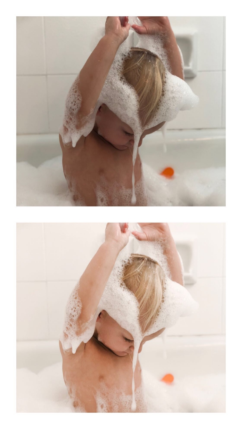
toddler bubble bath photo tips for moms.JPG
photo tips for moms.JPG

4. When you edit, keep your photos straight and centered. Use the crop/straighten tools and the perspective to adjust the angle vertically or horizontally. I will show you how to do this in SNAPSEED in this post, but you can use any app or just adjust them in your photo gallery in your phone. This helps with the rule of 3’s, by keeping your lines straight.

photography tips for moms.JPG
photography tips for moms2.JPG

5. Use the rule of 3's in photography to align the photo. This is so simple but makes the biggest impact. The rule of thirds is applied by aligning a subject with the guidelines. The basic principle behind the rule of thirds is to imagine breaking an image down into thirds (both horizontally and vertically) so that you have 9 parts and creating a horizon so that your eye easily moves from square to square.
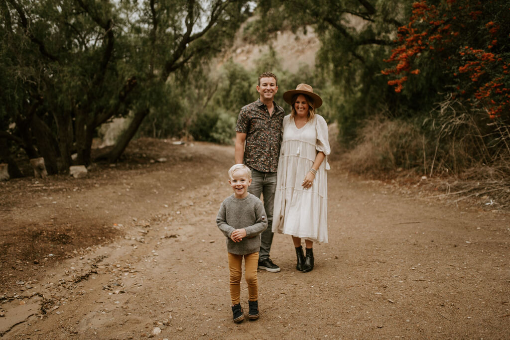
IMG_4870.JPG

6. Set your scene first and make sure you’re taking the snap straight if you can. If you have time take a couple practice shots so you can see if a weird outlet or random thing stands out in the image. Try and take photos straight on so when you align your subject, don’t shoot from the side of it, shoot straight at it. Don’t be afraid to move around! Taking images from all angles you wouldn't normally think would be good, sometimes get you the best shot! If you end up with something in the image you want to edit, I use RETOUCH. Like this picture below actually had a vacuum leaning on the sliding glass door. I edited it out with two clicks.

IMG_2551.JPG

7. Use your favorite preset or filter to keep all your photos consistent. Lightroom mobile is free and it is a professional photo editing app that usually you can editing in one click using purchased presets. Below are 6 images shot in very different settings and light but edited with the same filter. I’ll put some of my favorite presets in my post, How I create a consistent aesthetic in my photos. [other apps I use and love, snapseed, color story, and retouch].

IMG_1623.JPG
IMG_4475.JPG
IMG_3406.JPG
IMG_4662.JPG
IMG_3048.JPG
IMG_0039.JPG

8. This one is more for influencers or bloggers, but I use a planning app for my posts. I use planoly, it’s not a free one... but I’ve used it forever and I love it. I usually only post once a day but sometimes I get multiple images that day that I want to post so I save them in there. I store my hashtags and write and edit my captions ahead of time. This helps me see if a photo's colors or how I edited to fit into my aesthetic or if I need to adjust the exposure or temperature to fit the rest of the images before I actually post it.

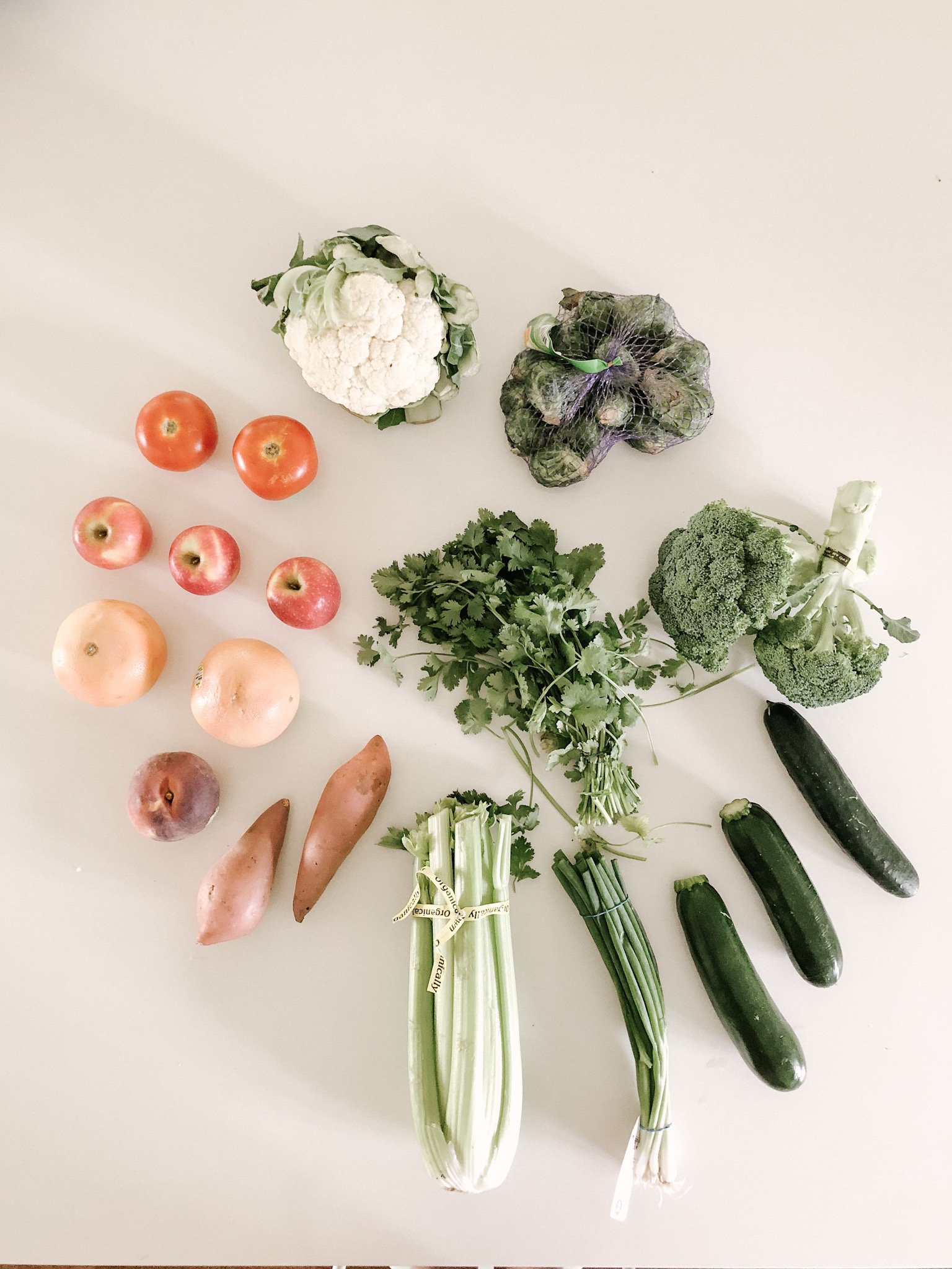
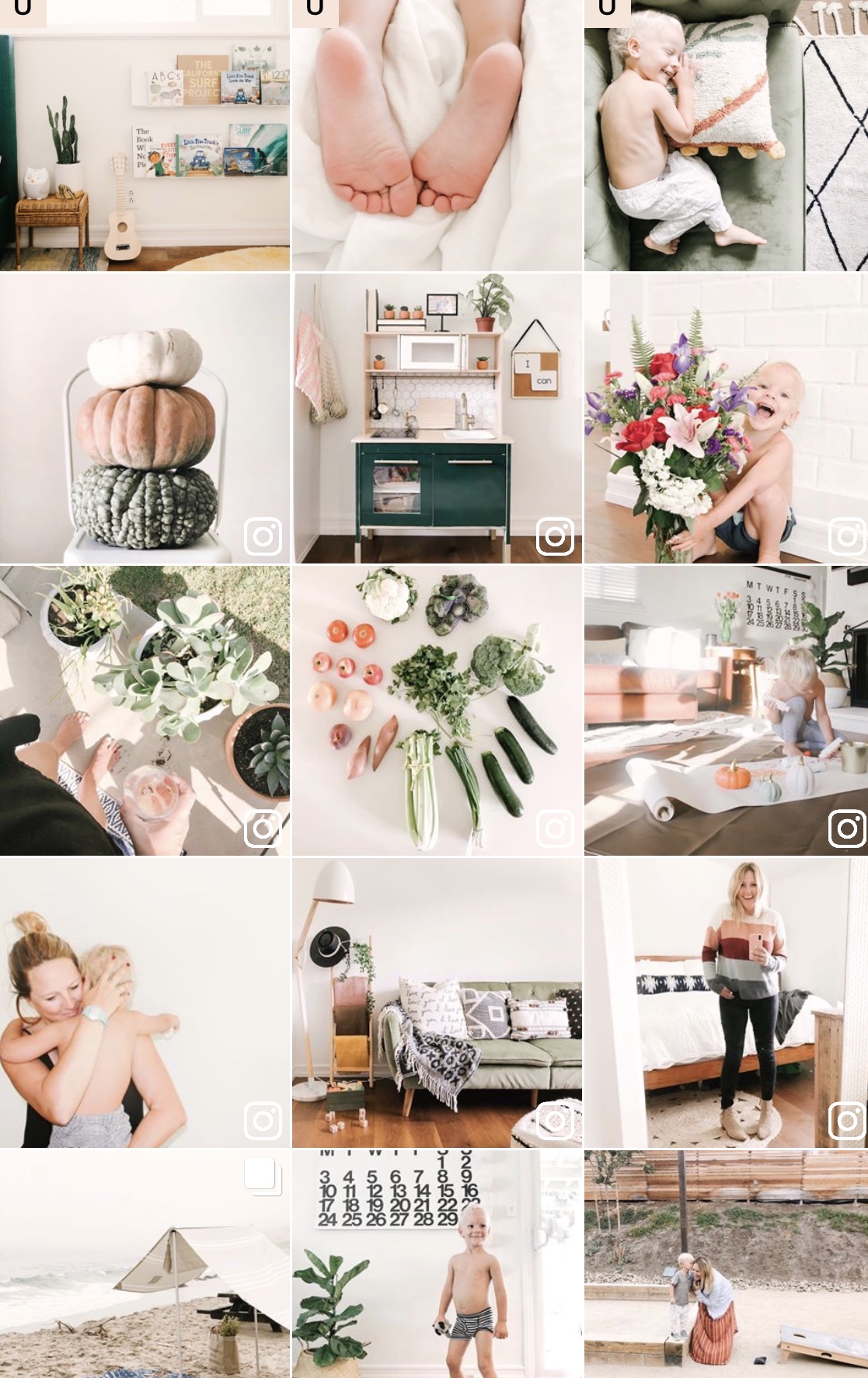
9. This is a personal preference but I use the grid method [maybe it’s called something different] but I staged my photos to have one light and one darker photo each time. Which creates a grid that is easy on the eye.

photography tips for mommy blogger planoly.jpg

10. Try, try and try again. The more you shoot, the better you will get. Same with editing. As you start to edit your photos, it will become second nature and then you'll learn another trick to making your photos the exact style and feel you are looking for.

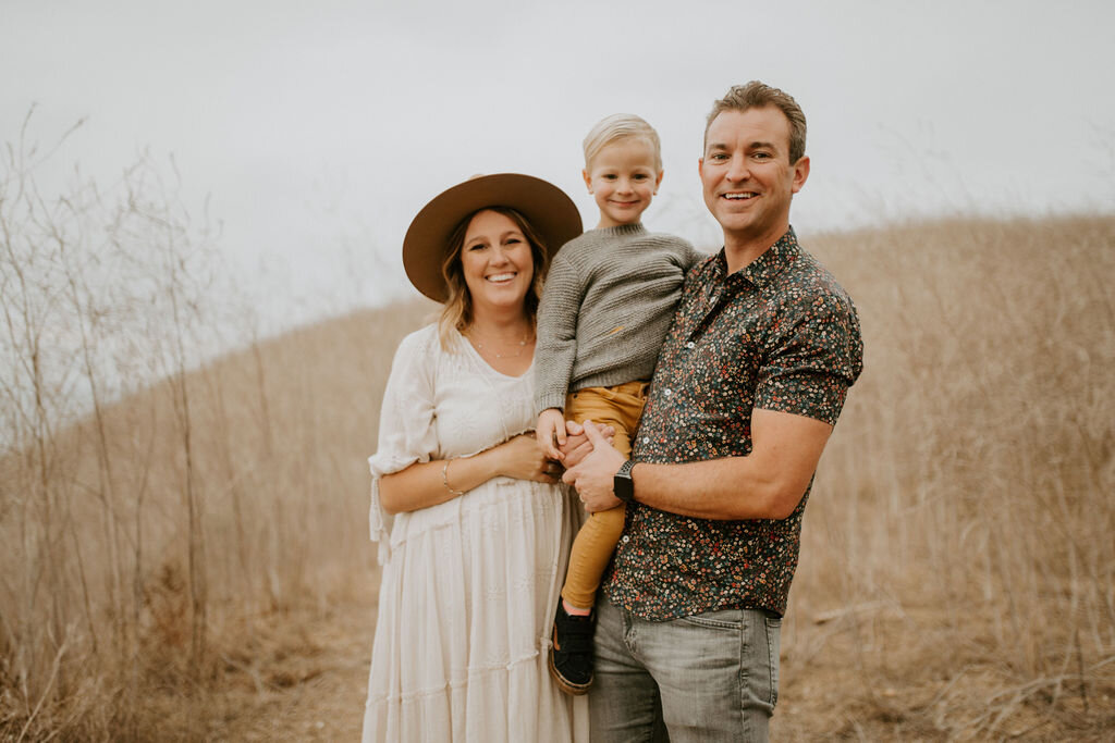
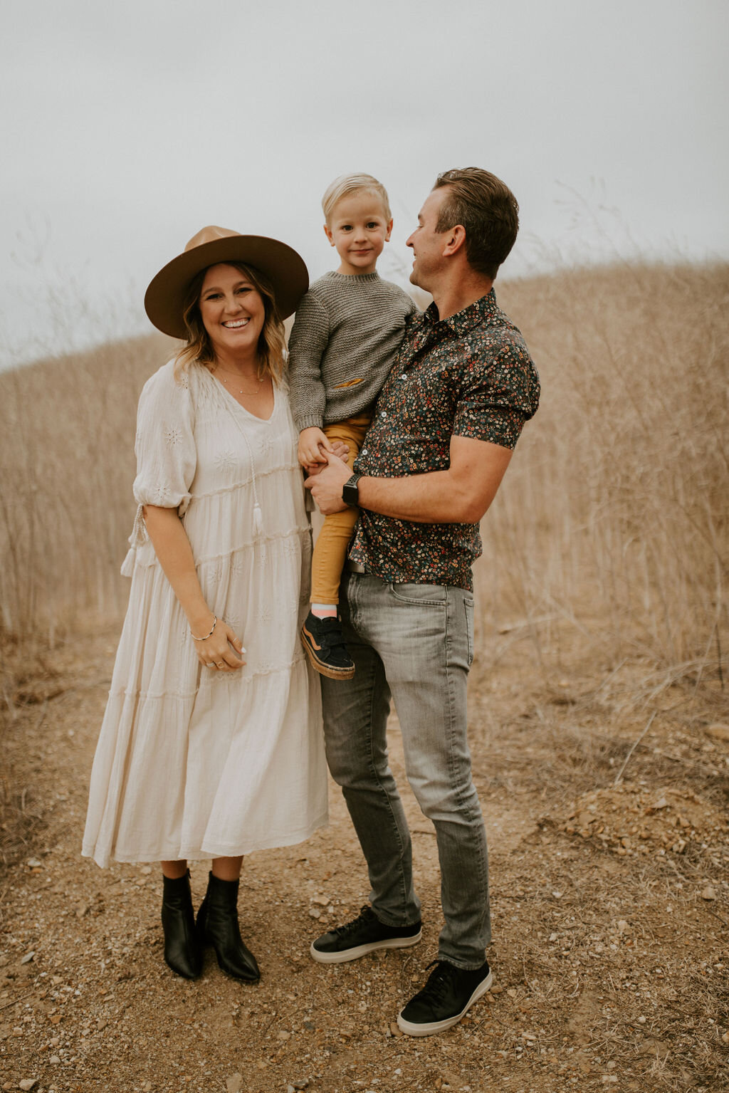
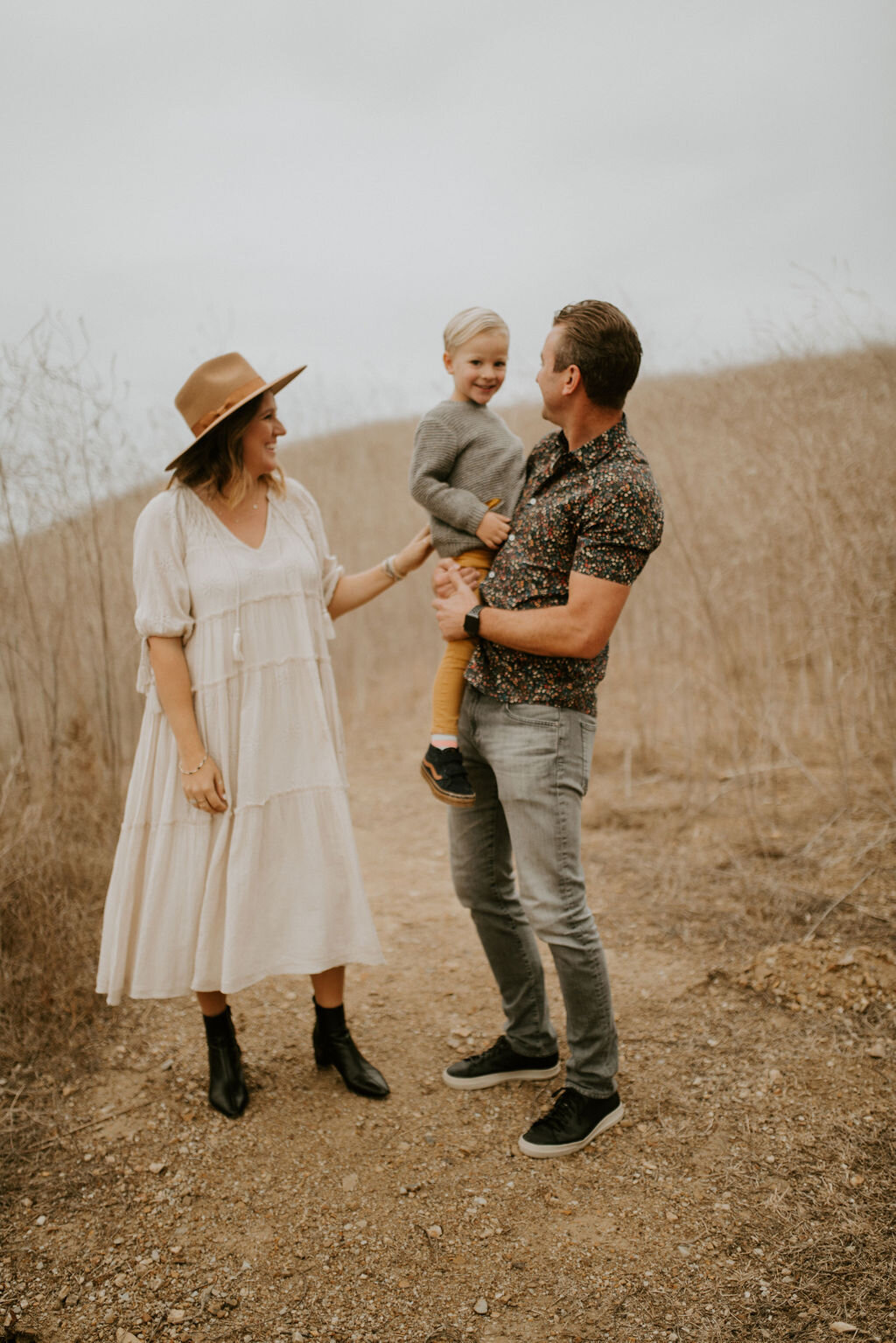
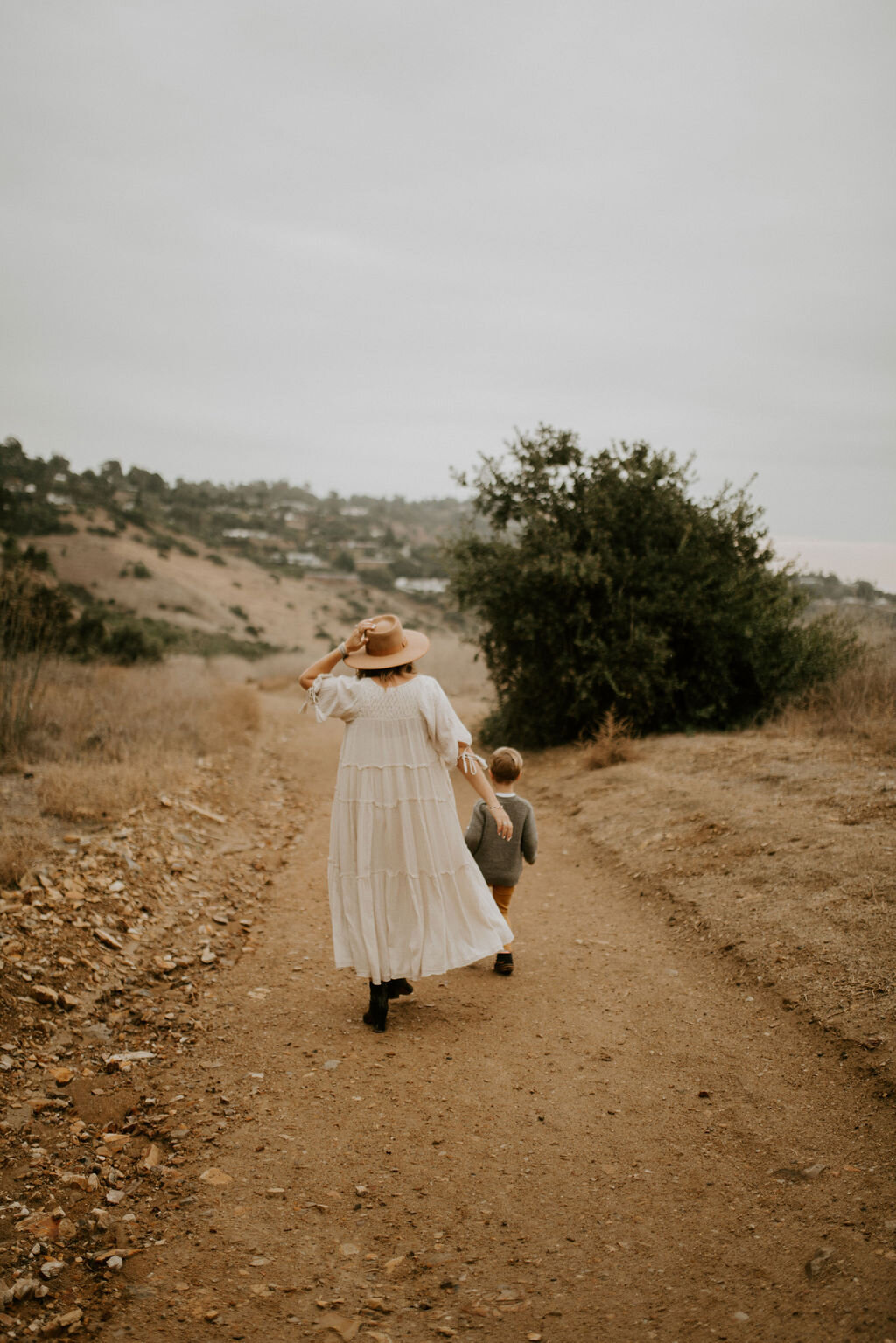
6 photography tips to create the perfect Holiday Cards

6 photography tips to create the perfect holiday cards

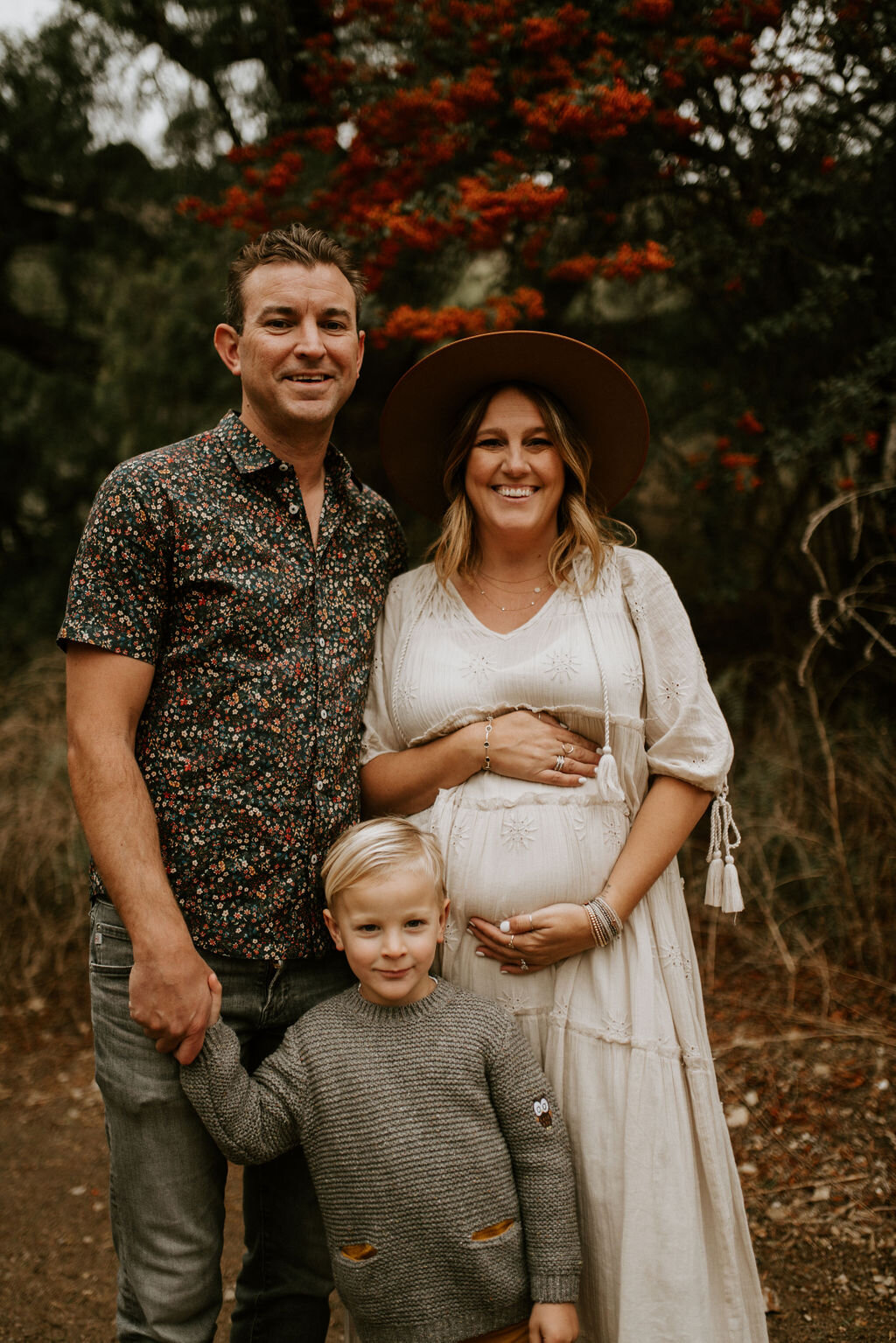
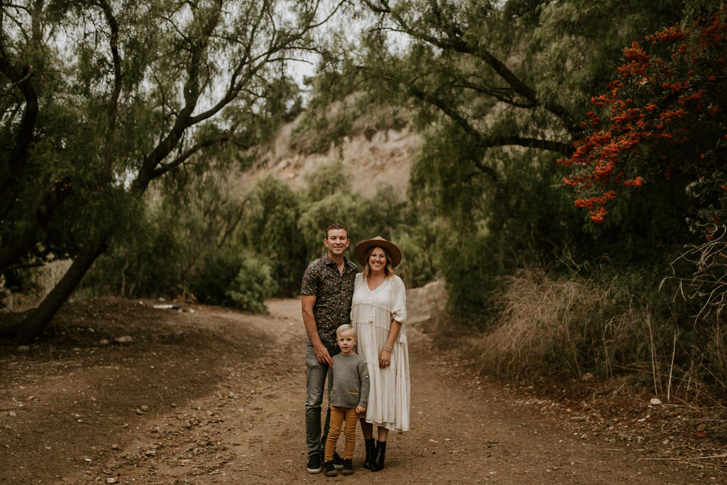
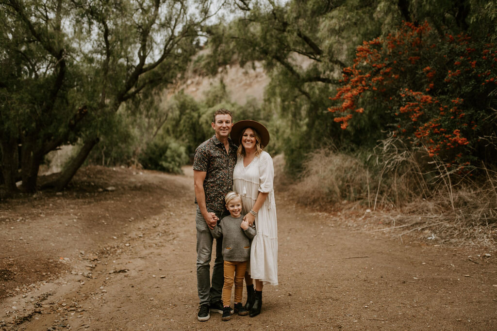
A huge thank you to Snapfish for sponsoring this post.  I received a credit towards my holiday card order in exchange for this review.  As always, I only share products I truly am obsessed with and all images and opinions are my own. 

Use code HEIDI40 at checkout for 40% off

AQ1A0039.jpg

The moment you go to your mailbox on Nov 30 and receive your first-holiday card, a state of panic comes over you.  How can I be so late? I don’t even have my pictures taken yet!?  Here in California is stays warm through those fall months and we don’t get snow so it’s easy to not get that holiday spirit early on.  

I do have to admit, even though a whole new level of envy and anxiety sets in when that over-achieving Mom sends me her cards that early, it does get me excited about the holidays.

AQ1A0441.jpg

I rarely check my mailbox, until December rolls around.  It’s true, nothing good comes from that metal tin until Christmas cards begin to arrive.  There’s nothing like receiving a picture filled card from friends and family during the holidays.  Am I right?  

So you start to think? What picture will I use? What will we all wear? What location has the perfect landscape? How can I make this year's card perfect?  All good questions but the truth is, you don’t need perfect, you just need to be you. 

AQ1A0183.jpg

Holiday cards are a way to celebrate all the good things this year has brought as you get ready for the new year. Sending seasons greetings to the ones you love, having that personal connection with a picture of you in their mailbox, let’s you share this year's joys with your friends and family.  Whatever goodness came this year, whether it is a new marriage, new home, job promotion or even just celebrating a good year, Christmas cards are something everyone looks forward too.  Luckily, you still have time to get that memorable Holiday card out that snags the front space on everyone’s fridge this year. 

Here are 6 photography tips to create the perfect holiday cards this year:

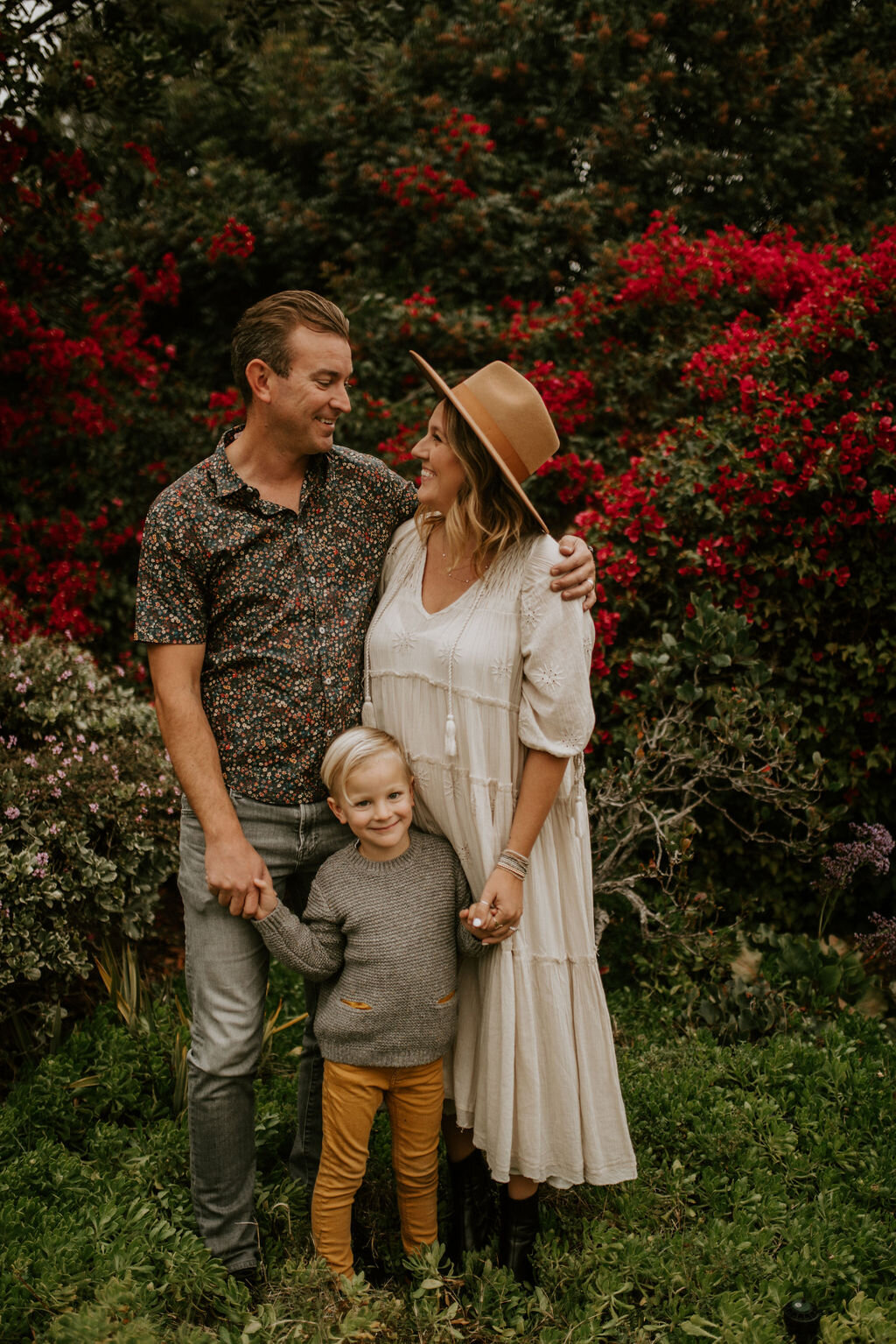
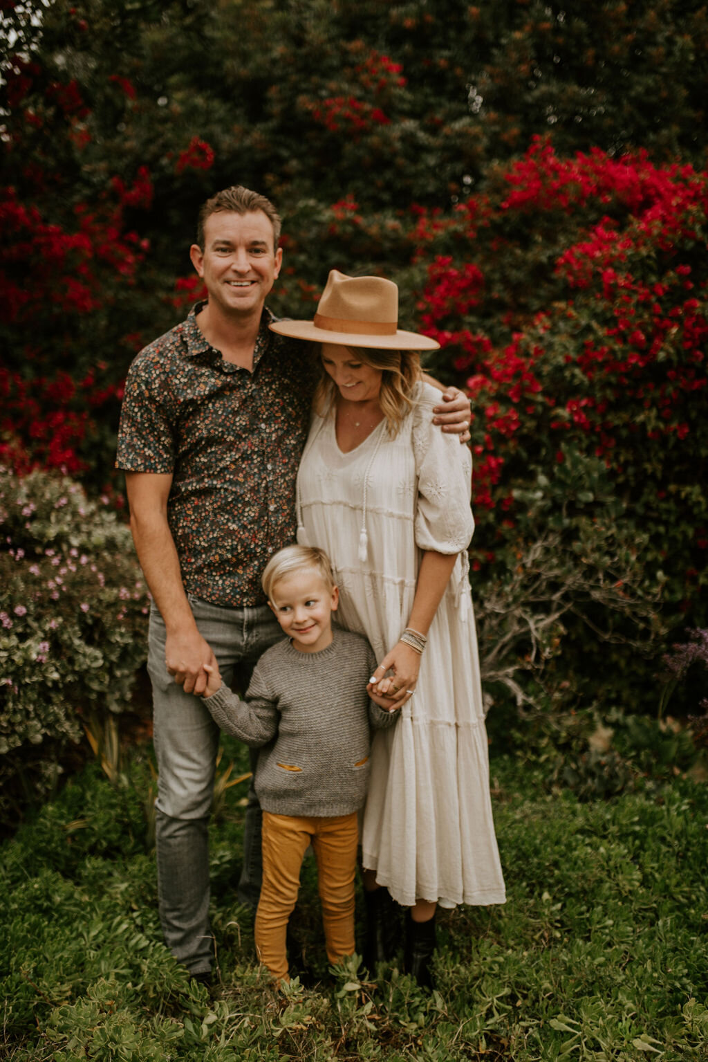
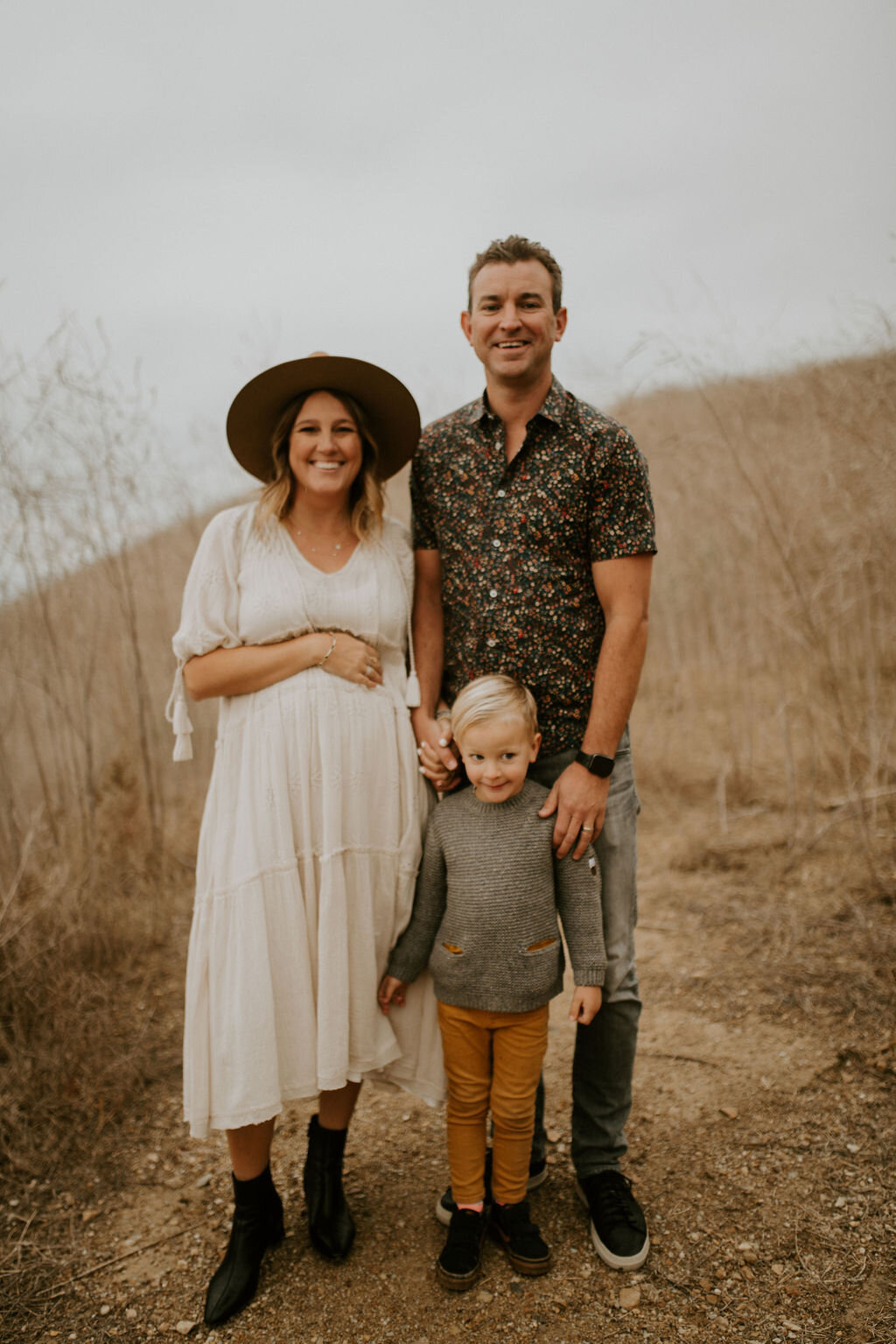
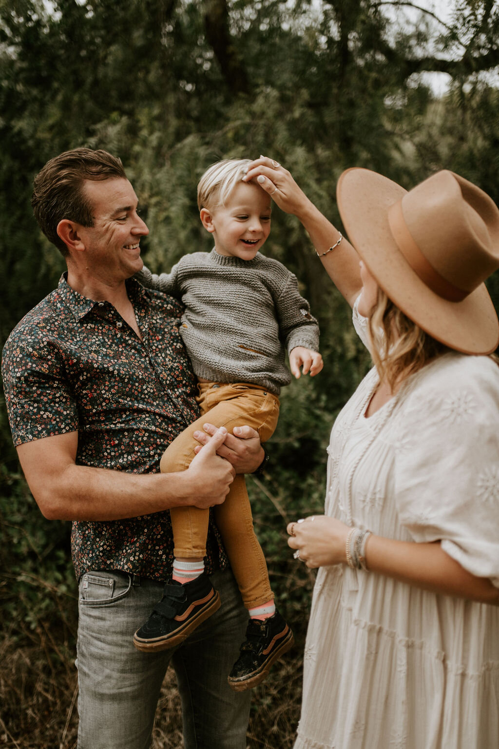
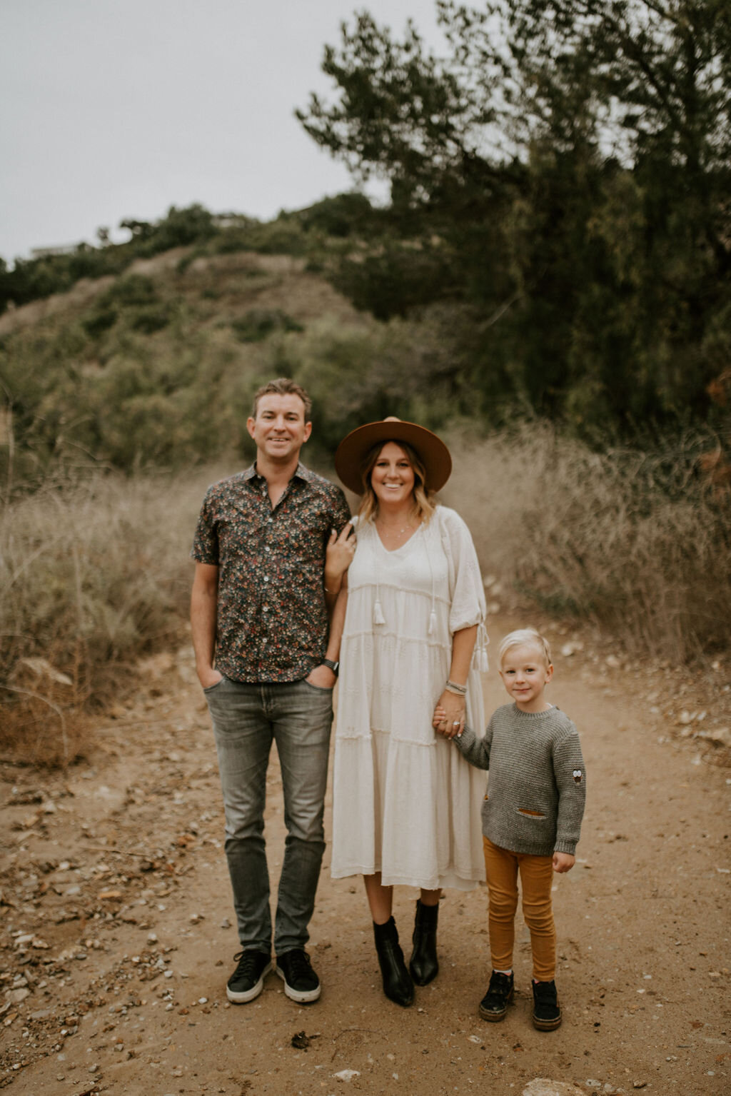
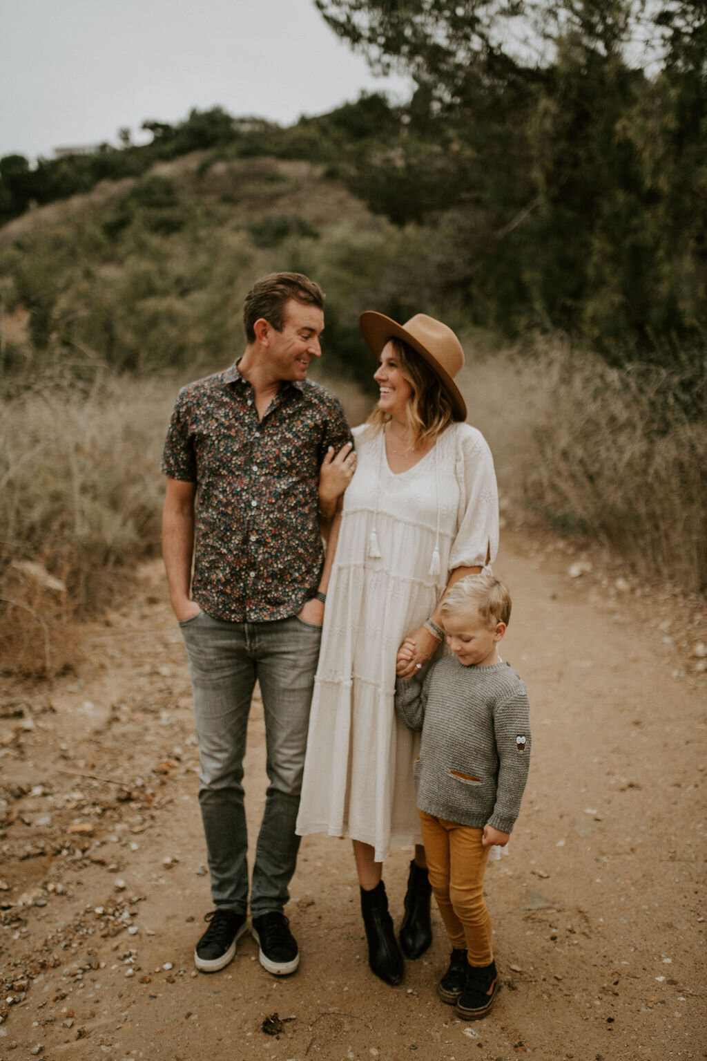
1. First things first.  Hire a professional to do the job.  Yes, iPhone photos are amazing these days and print beautifully and if you happen to have one of those right place, right time amazingly candid photos in your camera roll to use, USE IT!  Totally acceptable.  However, many of us, including yours truly, take 27 candids all of that perfectly curated shot only to scroll through and delete them all.  If that’s you, here’s why you need that professional. These cards may be keepsakes for grandma and grandpa or Mom and dad of their little ones each year, so you want these images to stand out.  If you're like me, we only do one family photos session a year, and this it, so hiring someone who knows what they are doing really is necessary.

IMG_3762.JPG

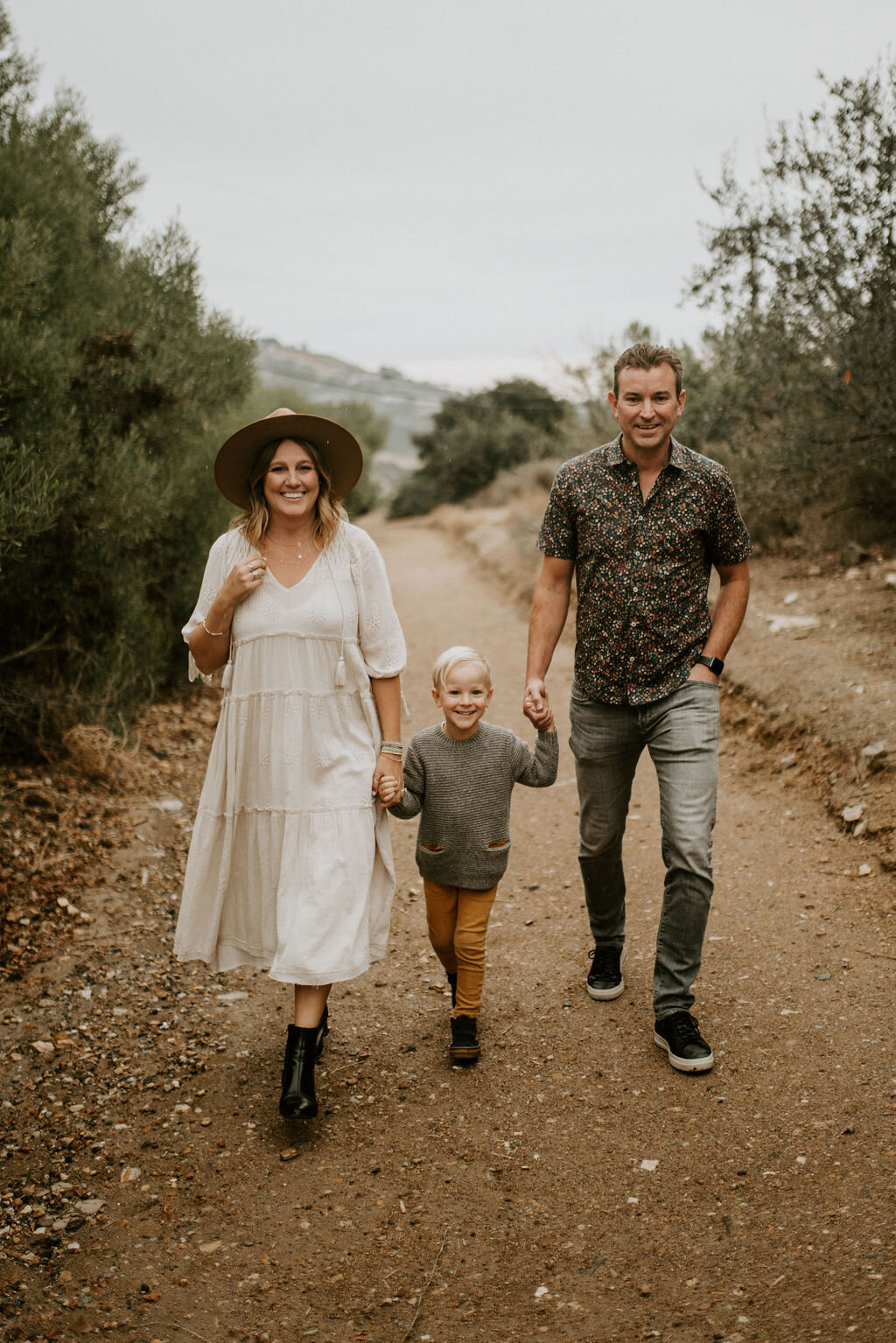
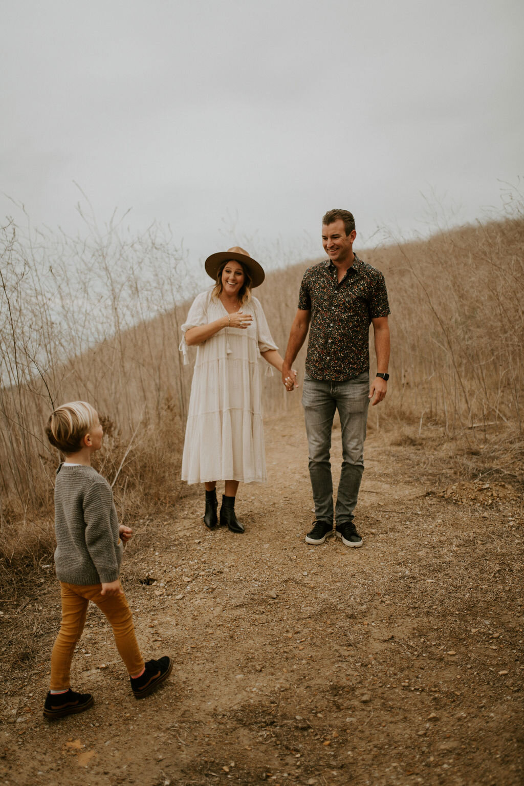
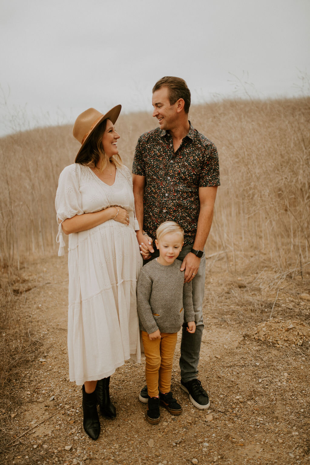
2. Don’t wait for a snowstorm or the perfect sunset to take those images.  Little known fact, I believe the best lighting is a cloudy day.  It brings this whole soft and ethereal feel to the photos if you ask me.  Bright sunny days, are hard to shoot in.  They cause shadows and nobody wants to be overshadowed by a shadow, right? [hahah]. Truth be told even though I love a cloudy day shoot, I dream of one day taking my photos in the rain,  you know, all The Notebook circa 2004 style.  All I’m saying is the pictures aren’t made by the perfect weather, they are made by you, the perfect people. 

AQ1A0166.jpg
AQ1A0218.jpg

3. Find simple and beautiful backdrops in your neighborhood. You don’t have to drive an hour away to stand in a winter wonderland or get all sandy at the beach [although I love a good beach scene] to get the perfect holiday image. Go the minimalist route and find a white wall to stand in front of or stop by that empty field you drive by on your way to work, or that brick wall down at your local mall, that’s the best one! Just find a blank canvas, grab your family and shoot.  Then you can choose from about 1000 designs on Snapfish to make your card pop. 

AQ1A0087.jpg

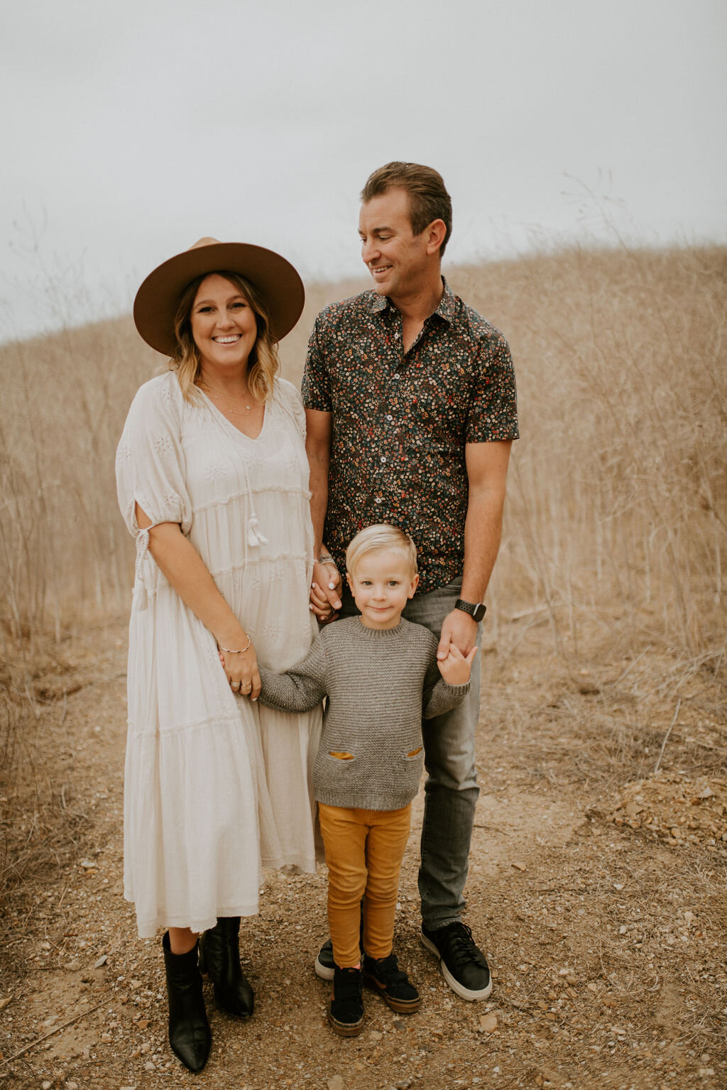
4. Use the same color palette but don’t be matchy-matchy. Nothing says Sears family Christmas cards like a family all dressed in white shirts and jeans, so, don’t do that.  Here are a few tips on styling your outfits: Pick 3-4 colors [no more than 5] and stick with those. Start with one person's outfit, probably your own because that’s easiest. Try and add in one print to bring it all together.  Add some texture with a scarf or vest.  And most importantly, be comfortable.  The last thing you want is to be fidgeting with your sleeves or pulling down your shirt throughout the whole shoot.  Nothing ruins a photo like you tugging your dress down in every photo. 

AQ1A0282.jpg

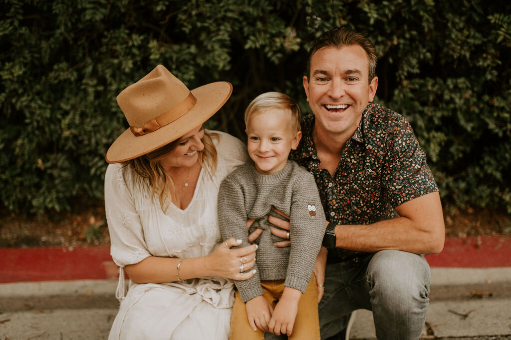
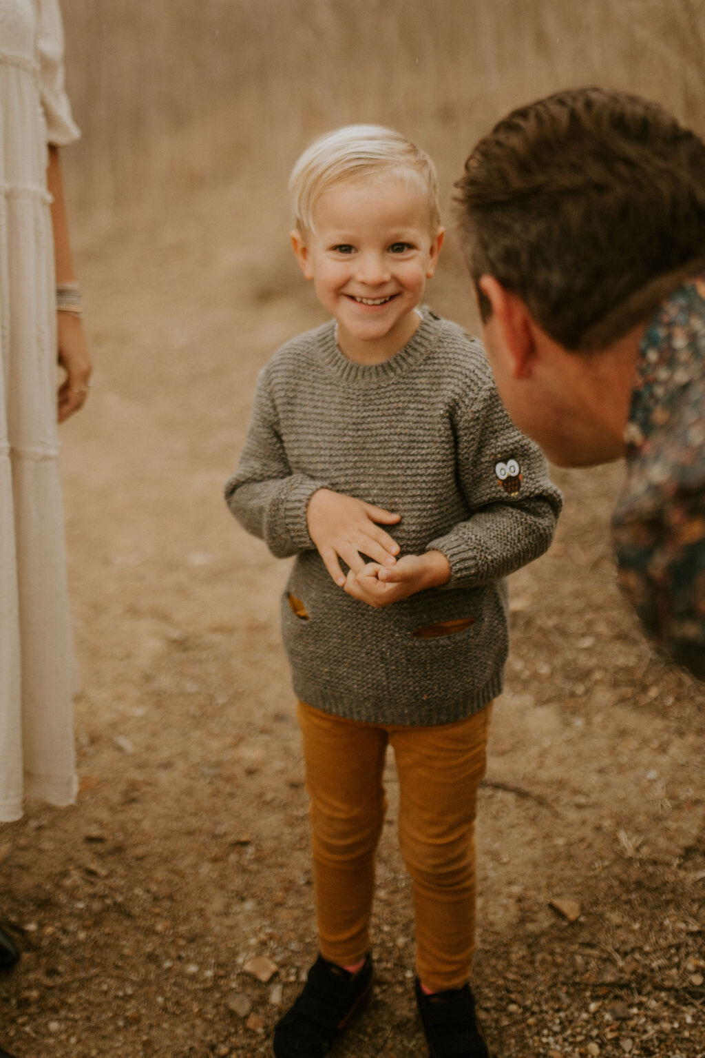
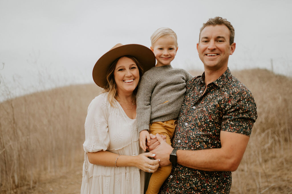
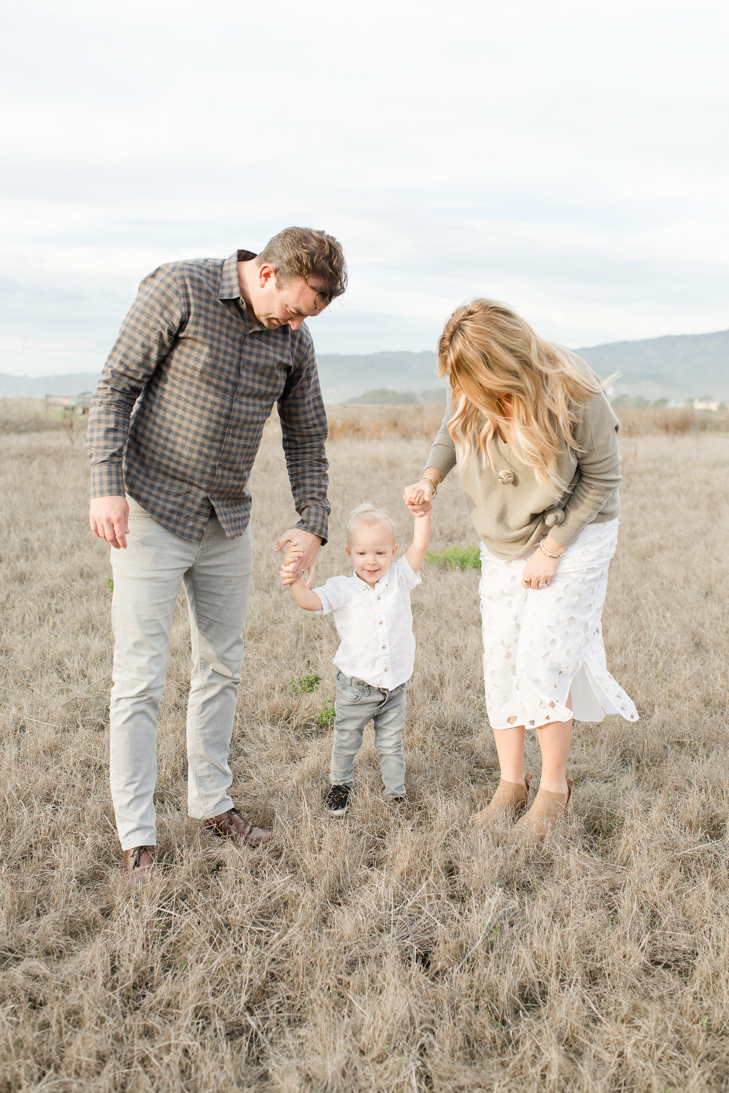
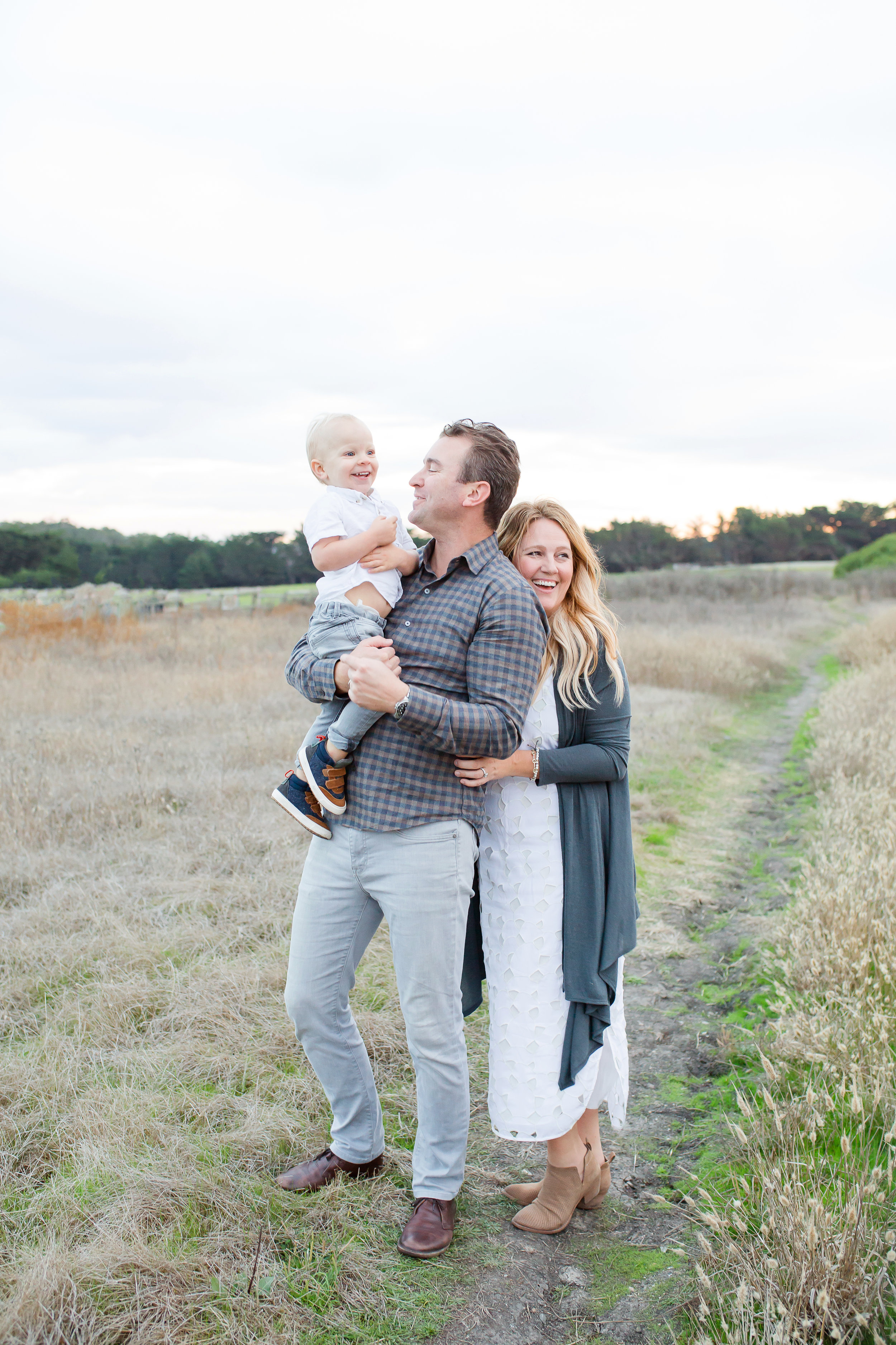
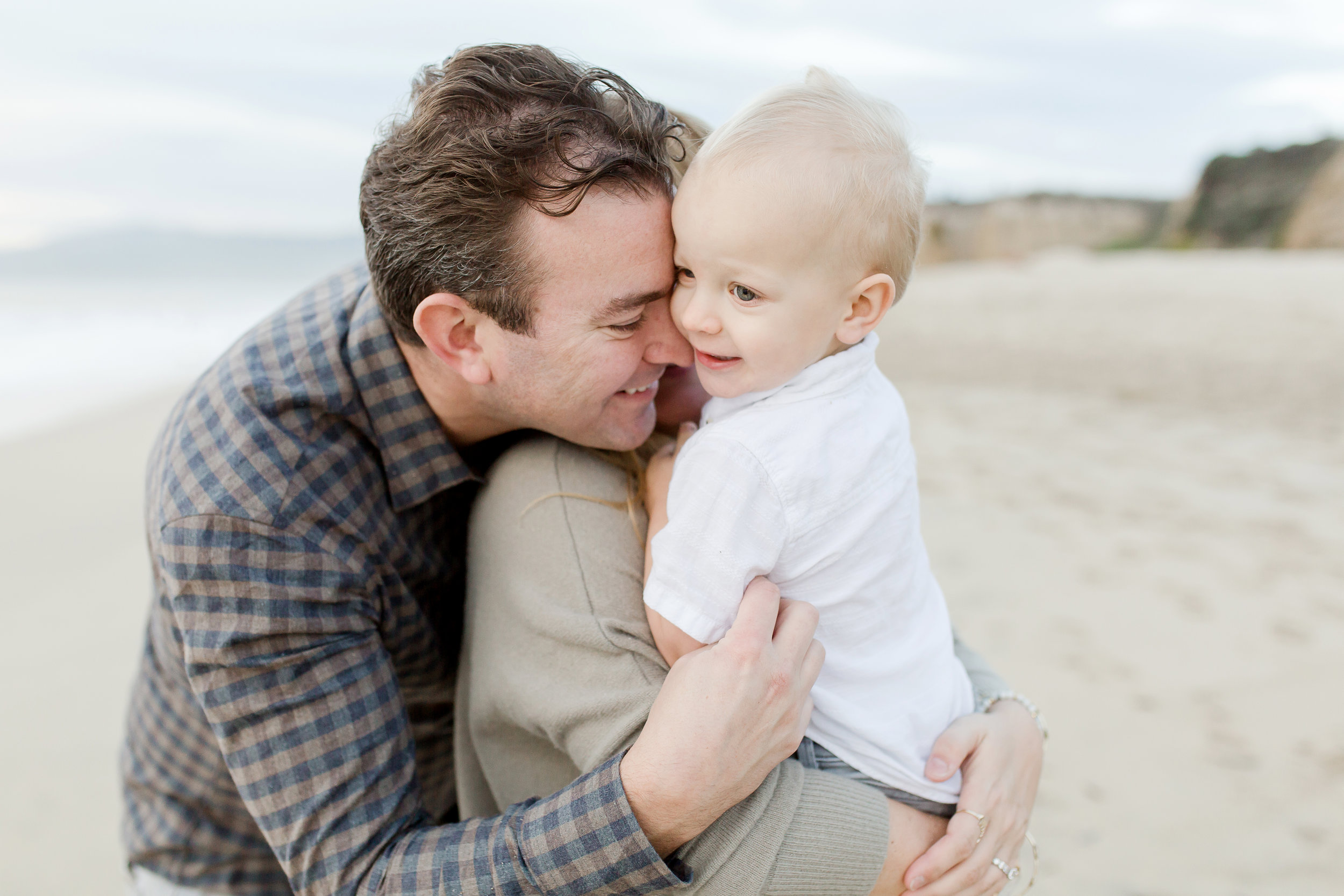
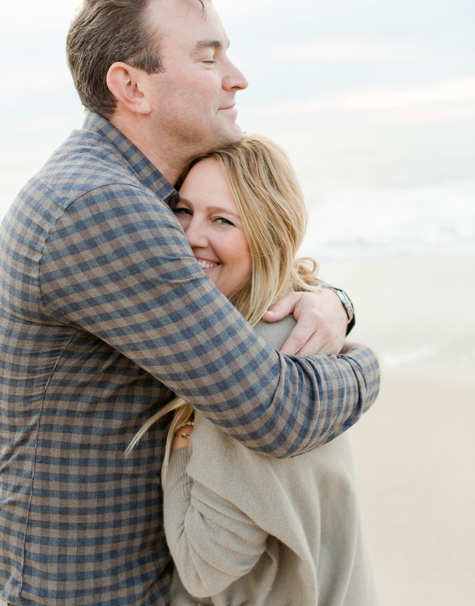
5. Embrace perfectly imperfect. We’ve all been that person.  The one who spends hours on Pinterest looking for the right outfits, the right backdrop, and the right poses for our family photos. Oh wait, that’s probably how you ended up here.  He he.  Well ok, so maybe your that person who’s more concerned with telling all your family members to look at the camera, or smile, or "look happy everyone."  And then all your images end up with your mouth open or your finger pointed covering your kid's face. Well here’s my number one tip, skip the perfectly posed, and go for the I’m having the best day of my life look.  Some of my most beloved images are ones where no one is looking at the camera.  It’s those candid, heartfelt moments and emotions that are snapped in between takes that are my favorite and those can’t be planned. 

AQ1A0249.jpg
AQ1A0051.jpg

6.  Don’t skimp on the quality of your cards.  I’ve tried several companies over the years and abandoned some once I saw the flimsy paper or poor image resolution.  This year I used Snapfish and I was super impressed by so many levels. I’m not super good at sending photos to family members with updates, so my holiday cards are the only keepsake they’ll have.  We didn’t even send a birth announcement for our first child because I just never found the time.  [It still bugs me I missed that] so, ever since then I’ve been determined to do one photo shoot a year and it’s for Holiday cards.  Needless to say, since this card is the only thing I send all year, the quality needs to be good.  Photos printed on good paper, don’t have to be expensive or take forever to get.  Snapfish has tons of designs, and cardstock options and they get the job done in a couple of days. 

AQ1A0363.jpg

Lastly, don't take this process too seriously.  These photos should show your playful and happy side and if you make this a stressful event, it will show through in the photos.  Have fun, play around, have a tickle fight, throw your little one in the air and laugh, and you'll end up front and center in everyone's fridge this year.  

AQ1A0235.jpg


With Snapfish you have so many great layout options including these gold foil cards I chose.  They offer fast shipping for your procrastinators like me too.  And to save even more time, you can have you return address printed for free.  I won't be using any other company besides Snapfish from now on for all my card needs.  USE CODE HEIDI40  for 40% off your order.

9D8E0971-6A1D-416E-A85C-6555515F4530 2.jpg


PC: @ameliaprotiva


This website contains some affiliate links to products that we use and love. A very small percentage of purchases made through these links goes to help support our family in a small way. Thank you for following along.